CASE STUDY / 04 OF 07
Brisa
Website Revision & UX/UI Enhancements
A usability and visual refresh for a familiar Portuguese brand.
CLIENTBrisa
YEAR2022–2025
ROLEUX/UI Designer
FOCUSUX review, Navigation, Responsive
TOOLSFigma · Adobe Creative Cloud
01 / OVERVIEW
The context
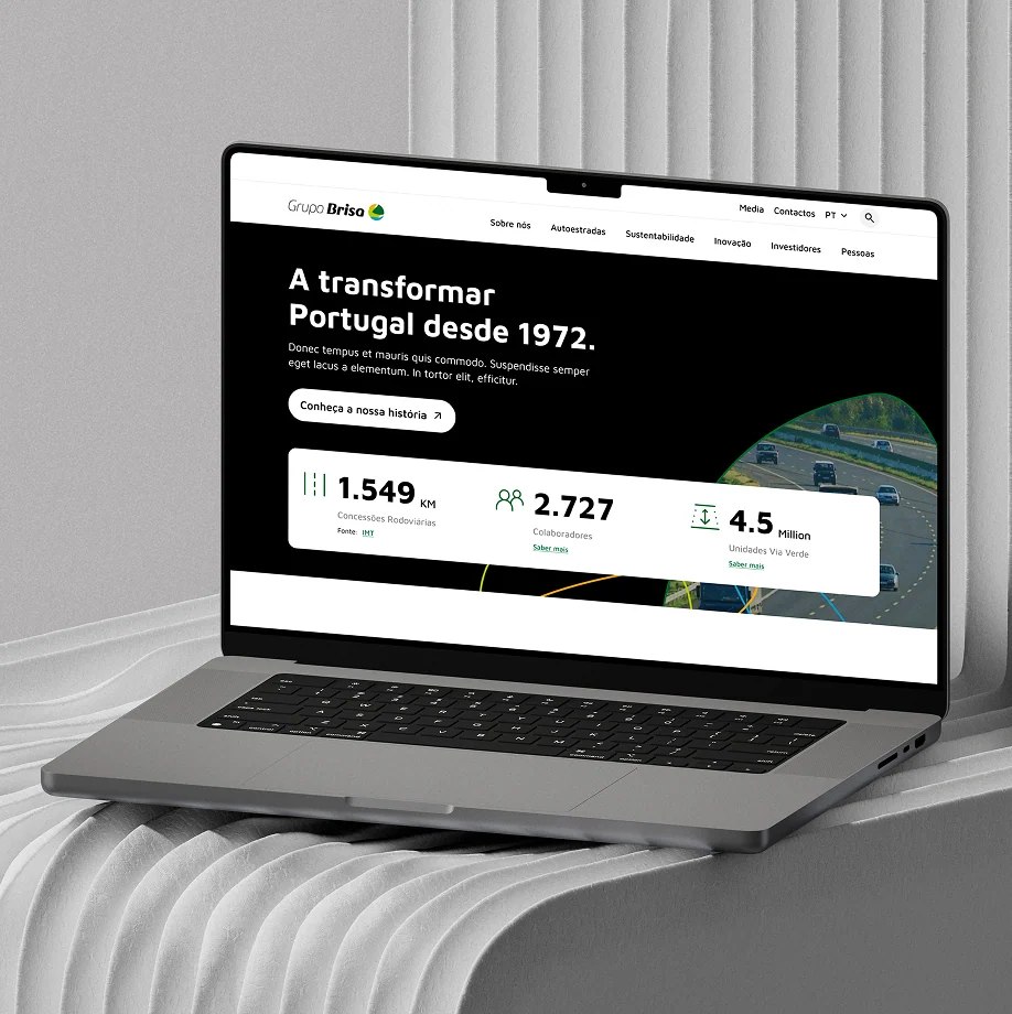
Brisa’s website needed to better reflect its evolving brand identity and user expectations.
The challenge
Improve navigation clarity, interactions and visual hierarchy across the platform.
02 / MY ROLE
What I did
I reviewed user flows, updated interface elements and worked with developers to resolve bugs and improve responsive behavior.
03 / PROCESS
From thinking
to making
- 01UX/UI review
- 02User flows
- 03Navigation refinement
- 04Visual hierarchy
- 05Accessibility review
- 06Developer collaboration
04 / DESIGN
Ideas in detail.
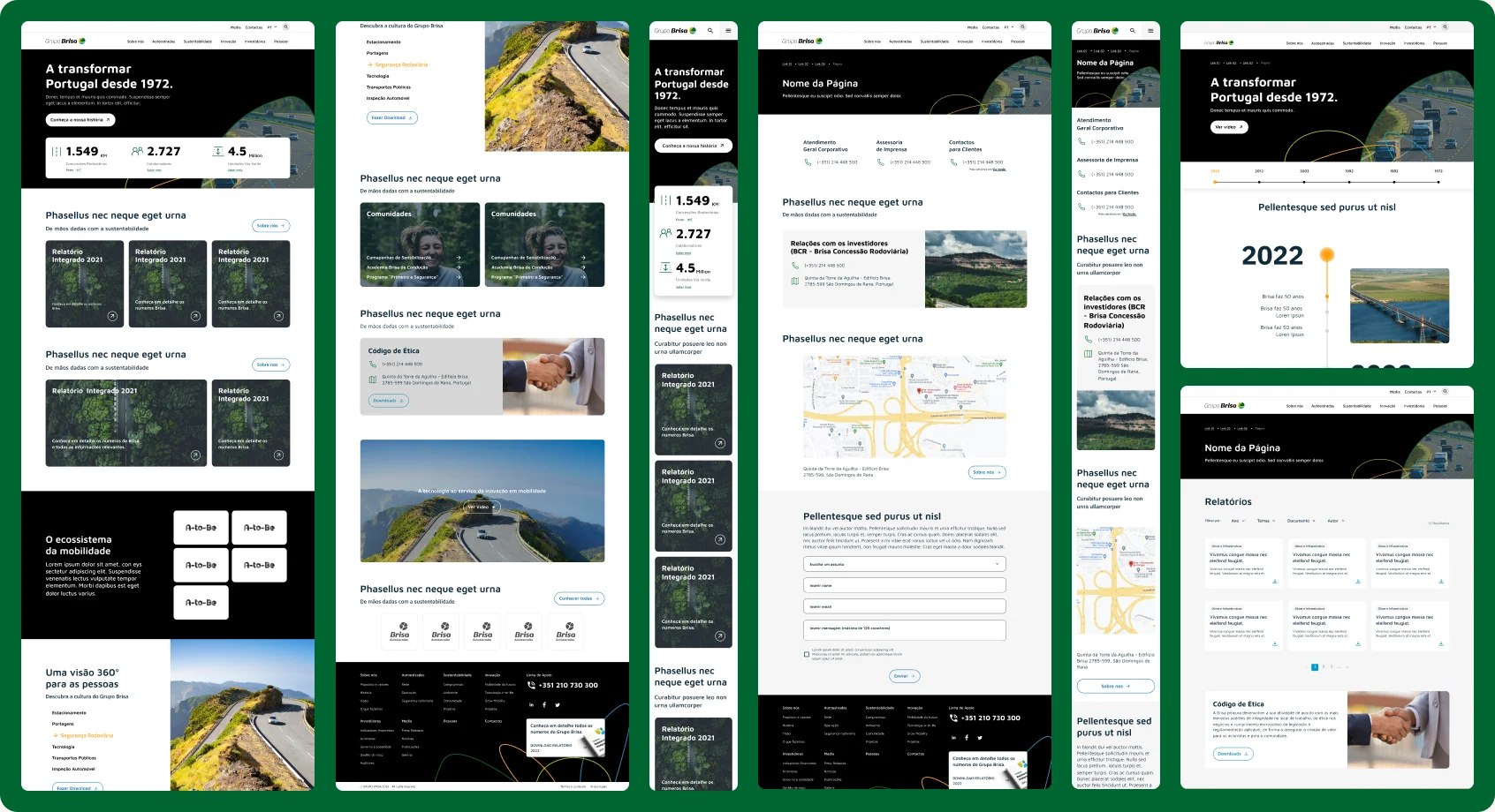
The redesign refined the color palette, layouts and components, with attention to accessibility in key sections.
09 / OUTCOME
What moved forward
A set of interface and usability improvements. The original portfolio labels this work in progress.